Figs and Blossoms
Project scope
UI/UX design
Shopify Web development
Project status
Launched in December 2022
→ https://figsandblossoms.com/
Tools
Figma
Shopify
Adobe Illustrator
Overview
Figs and Blossoms is a personal and home care brand that produces a line of heavenly-scented sanitizers, soaps, reed diffusers, candles, and odor absorbers.
After ordering a few of their products, I noticed that the user’s journey through their website could be improved. I contacted the owner and proposed a redesign.
Research
Before any changes were proposed, research was conducted through the following:
Went through the user journey with the focus on brand awareness
Experienced the user journey with the intent of making a purchase
Discovered best UI/UX practices of top Shopify websites in the same industry
Discussed buying patterns with the owner of Figs and Blossoms
Findings
It was a little confusing to navigate the website.
Figs and Blossoms has a wonderful collection of product images. However, the layout of the website was unable to emphasize this.
Most buyers prefer to buy through Instagram. Website sales pick up during the months leading to Christmas.
Solutions
Organized the navigation menu
Optimized product titles
Enhanced product images
Redesigned the home page
Organized the navigation menu
The navigation menu had a few redundant links:
It had a link for Search and a magnifying icon that has the same function
There were three ways to explore products: Collections, Gifts Sets, and Catalog.
Collections led to a page which contains different shop categories.
Gifts Sets is the best-selling shop category.
Catalog led to a page which contains all products.
I proposed that we simplify the navigation menu because redundant links were:
Complicating the process of exploring products
Subtly inducing choice paralysis, and
Unnecessarily consuming users’ mental capacity, which should be conserved for purchasing decisions.
In the redesigned version, I’ve optimized the navigation menu by:
Removing the Search text link, and
Replacing Collections, Gifts Sets, and Catalog with Shop. Clicking Shop will now open a submenu that allows users to explore each shop category or all products.
Optimized product titles
Gift sets are one of the best-selling products of Figs and Blossoms. While going through the All Products page, I noticed that the gift sets were named Set A, Set B, Set C, Duo, and Trio. I had to click each one to clarify what was included in each set.
To help users browse through All Products, product titles were updated to be more specific. By doing so, we:
Armed the user with more information earlier in the user journey
Reduced the number of clicks for a potential buyer, and
Increased the probability of a purchase.
Optimized product titles
I also observed that some, but not all, product titles started with the volume of the product (e.g. 100ml Reed Diffuser, 50ml Hand Soap, etc.). When the filter is set to Sort Alphabetically, product titles that begin with a number go straight to the top of the list. Hence, the sorting has become inconsistent. Half of the time, products are sorted by volume; the other half, by name.
To fix this, product volume was moved to the end of each product title. By doing so, we:
Removed inconsistency in product titles
Reduced confusion for users, and
Made it easier for users to navigate the website, explore products, and make purchasing decisions.
Enhanced product images
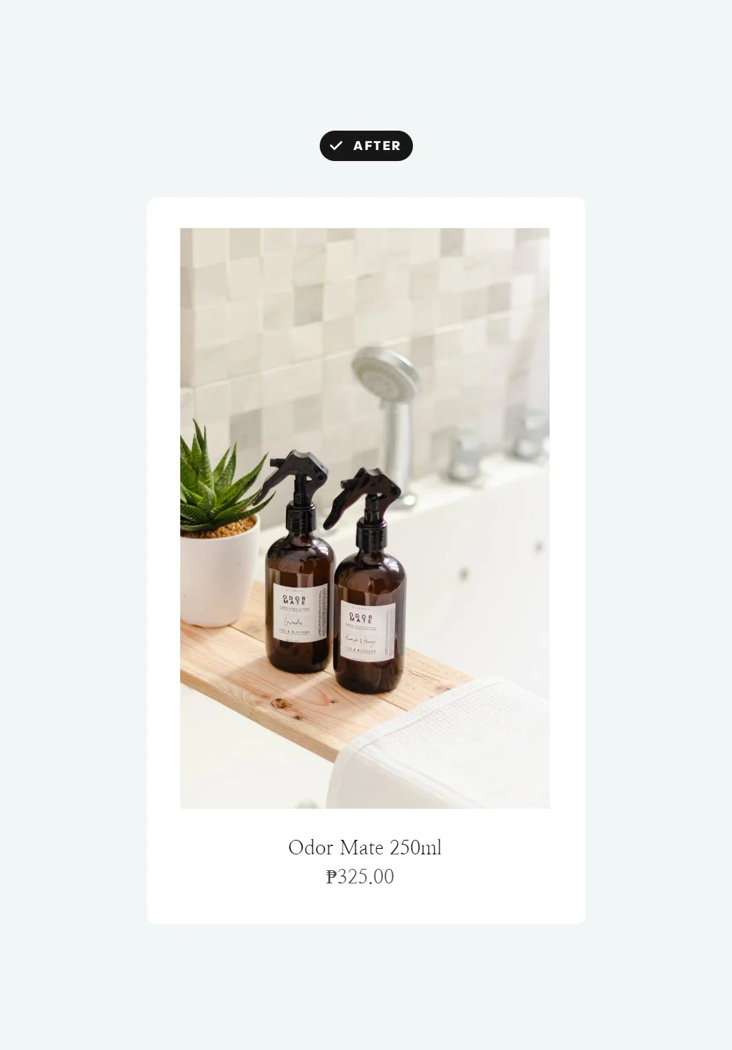
Browsing through the All Products page also revealed that product images were inconsistent in size and orientation. Some were portrait while others were square.
Initially, I suggested we edit the product images to have similar sizes and re-upload them onto the website. However, this was going to take a lot of time. So instead, I fixed this through custom code.
By doing so, we:
Improved the page layout, making it more professional-looking
Made it easier for users to browse products through consistent visual patterns, and
Enhanced the brand’s image.
According to Janine Sy, the owner of Figs and Blossoms, she always hires a professional photographer for her product images. This helps her maintain a gorgeous and consistent social media feed, which is vital for her business.
However, the website did not look as impressive as the brand’s Instagram feed, even though the former uses the same images. There were times when I found myself squinting, trying to view the products.
To fix this, the size of product images were increased across all pages and the number of products in a row was reduced. By doing so, we:
Boosted the products’ appeal, and
Made it easier for users to visualize the products.
Before
After
Redesigned the home page
Changes to the product images were brought over to the home page. A few more design improvements were added to accentuate the brand’s sophisticated vibe.
Abby is such a pro! She’s not only an expert at what she does, but she makes it fun and easy too!
She’s so generous with her knowledge that even when you think your website is at its best, she just has more and more to share.
Upgrading the look and feel of my website to ensure a better customer experience has never been more relevant ‘til she enlightened me.
Thank you for doing such an amazing job, Abby!
Janine Sy, Owner of Figs and Blossoms


